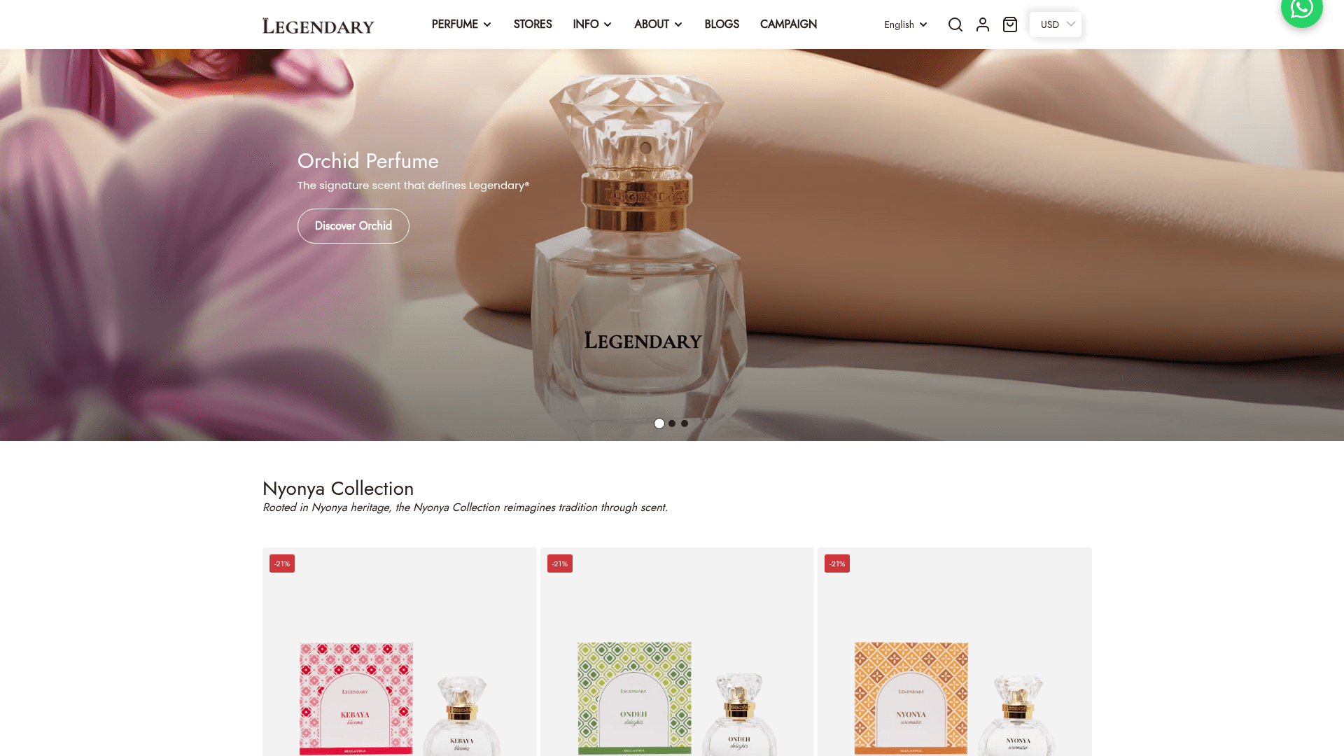
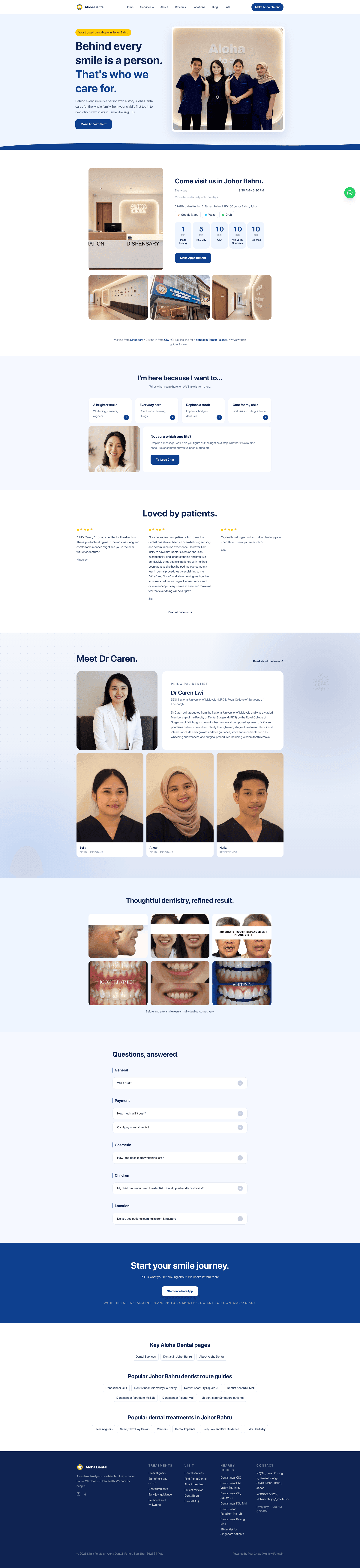
Custom components, not template sections.
Campaign banners, launch sections, gift bundling, and social proof, all built for how Yera launches product, not how a generic theme expects them to.
Introduction
Yera makes athletic and lifestyle wear with Asian-fit sizing. Good product. The store wasn't doing it justice. No real market setup for Japan and Malaysia, no trust signals, no loyalty program, nothing built to convert.
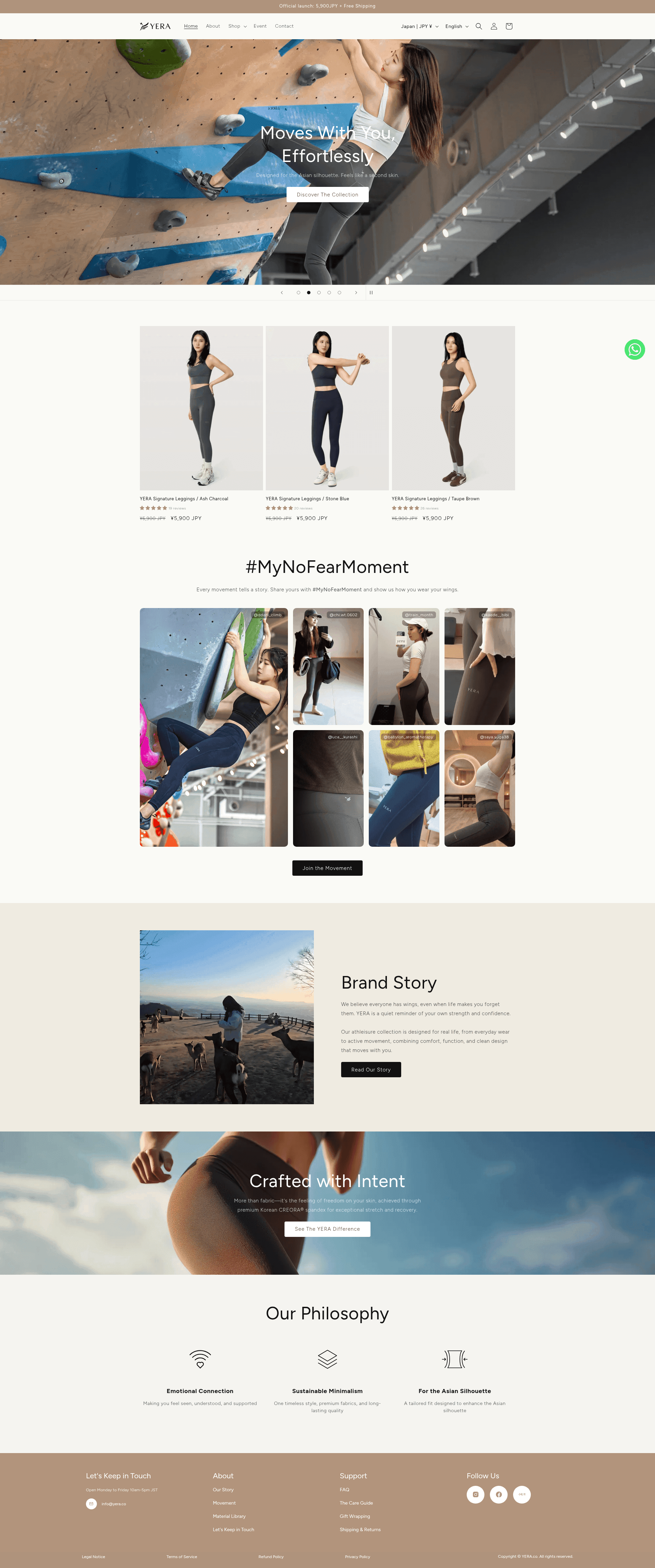
We went deeper than theme customization. Multi-market language and currency. Accounts rebuilt and migrated clean. A review flow shoppers actually trust. A size guide that answers the one question every activewear buyer has before they buy.
The result: a store easier to shop, easier to trust, and built to scale with Yera's launches.
Project type
E-Commerce
Services completed

Challenges
The theme couldn't tell Yera's story. Default sections weren't built for product storytelling, campaign drops, gift offers, or market-specific merchandising. Every launch meant fighting the theme.
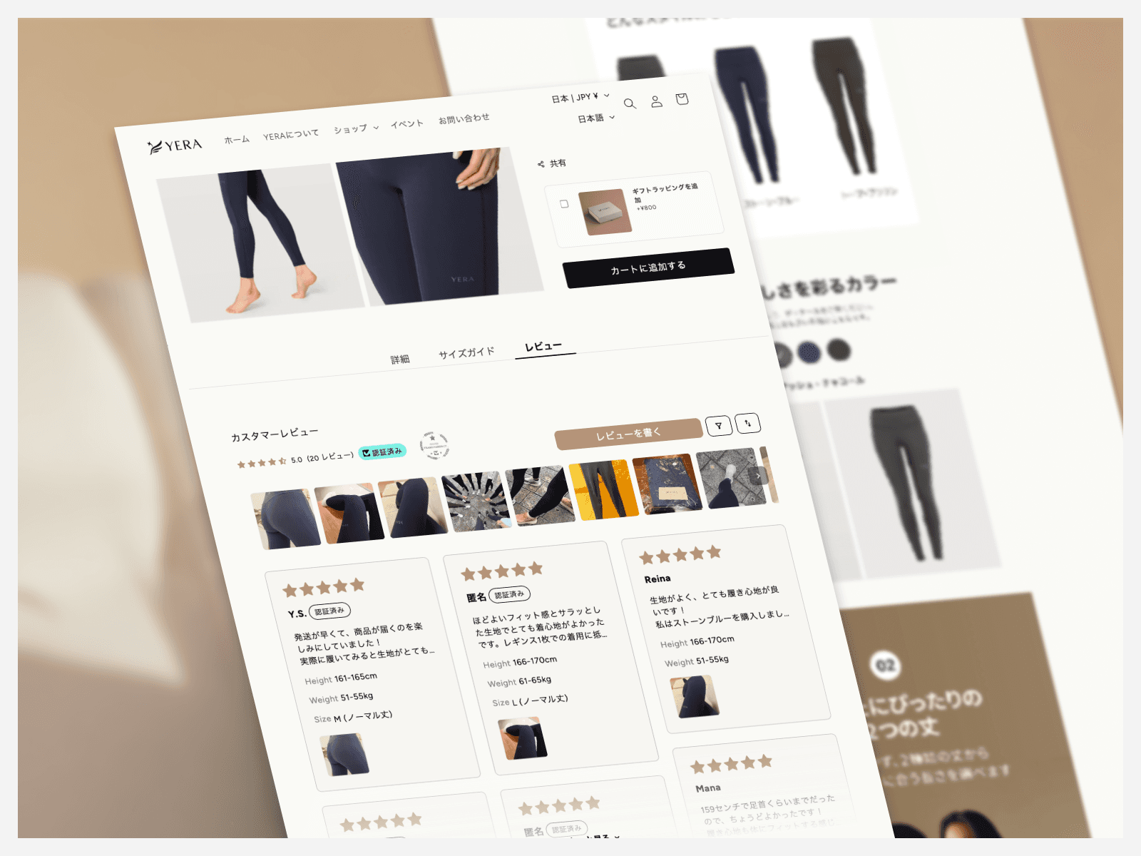
Shoppers didn't trust the fit. Activewear lives and dies on fit confidence. No real review system, no photo proof, not enough detail to get someone from "interested" to "in cart."
Two markets, one broken setup. Japan and Malaysia need different pricing, currency, and language, and existing customers needed to move over without losing their accounts.
What We Did
Campaign banners, launch sections, gift bundling, and social proof, all built for how Yera launches product, not how a generic theme expects them to.
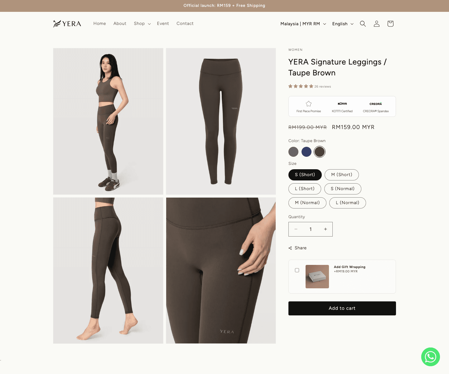
Sizing, color options, gift wrapping, material proof, and a size guide that does the convincing before checkout has to.
Photo and video reviews, smart filtering, loyalty points, coupons, and referrals built to keep customers coming back.
Region, currency, and language switching that makes JP and MYR shoppers each feel the store was built for them.
Existing customers logged in and picked up where they left off. No re-registration, no lost history.
The Result
Yera now sells across Japan and Malaysia without compromise, with stronger fit confidence, real social proof, loyal customers, and returning shoppers who never noticed the migration happened.
Multiply
Tell me about your project - whether it's a website, software, e-commerce, or a funnel.
Share the project shape and I will come back with the next useful question.
You will know what needs to be built, what can wait, and how launch should work.